Just another notes app. BUT unlike any other. 🛸
By Thameem Hassan • Dec. 29, 2021
Creating a notes app seems to be the first thing every indie developer tries at the beginning. And most of them inevitably get lost in the vast ocean of notes apps on the Appstore. A couple of years ago I released my first app called “Pentanote”. I removed it from the Appstore after a week because even I didn’t want to use it. It didn’t turn out the way I envisioned it.
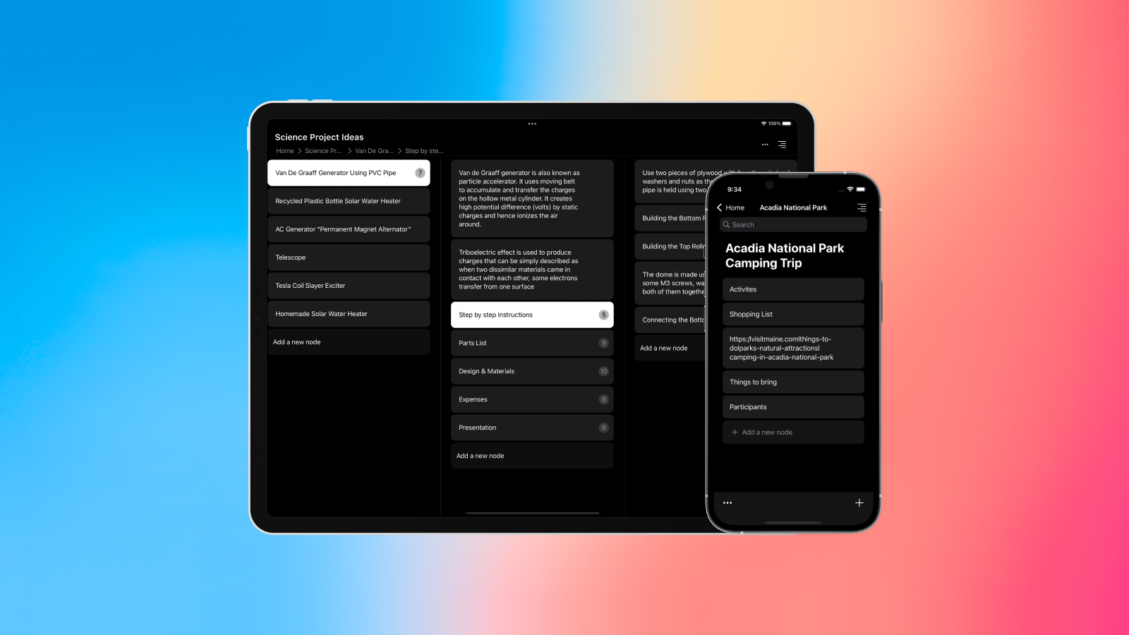
Recently I released my new app “Scroll” on the Appstore and it’s unlike any other notes app (at least the one’s I know of). Scroll is modern outliner for your notes, lists, to-dos and more… If you struggle with organisation, then scroll will be a game changer as it requires no confusing titles or folder names. You just tap on a note to focus on it and add details. And repeat the same to add more details. Scroll is ideal for lists and todos. You can track your progress by marking notes as “complete” as you go on.
At first I tried using the same UI for the iPhone and iPad apps. But as you might expect, the iPhone UI just didn’t suit the much larger screen of the iPad. So I designed a new UI specifically for the iPad. It uses side by side columns for easy navigation though the hierarchy. Also, your data is automatically synced between your iPhone and iPad so can pickup where you left off.
If you end up using the app please share you thoughts on it. You can reach me on Twitter @TH2049.
